#Project #2: Unemployment and Correlations
#Group #7
#Jaydip Patel, Vincent Chang, Nicole Haberer, Ivy Wang, & Griffin Parr
This project asks for you to collect and work with data in a realistic setting. For this assignment,
1. Write a brief and insightful typed report on your findings using the data.
2. Asanappendix to your report,include the relevant R code and output (scriptfiles,logfiles,etc.)
you used to perform the calculations you discuss in the report.
3. In the main text of your report, you should have typed tables and figures that help you summarize nicely the relevant computations and graphics from this output (not all output is relevant to a coherent discussion).
John Taylor’s Other Scatter Plot:
Gist: the purpose of the project to work on statistic concepts: Sampling distribution, Inference concepts, r practice etc.
One >>>>>
Construct the data set that generates this scatter plot. The source is FRED, 4 a great source for data on macroeconomics aggregates. When you download the data from FRED, it is helpful to save in .csv format and read into R using read.csv(). Make sure you have obtained the right series of data. You may need to transform data you can download into the variables that Taylor plots. It may be helpful to merge the data into one data frame (merge() is useful for this). Finally, for the later parts of this problem, make sure you download the entire series of observations, not just the ones that Taylor plots.
Gobal Settings
##global adjustments starts 01
rm(list=ls())
#seed for replication
set.seed(100)
oldwarnval <- getOption("warn") #preserve old value
options(warn = -1) #warnings are silent now
##global adjustments ends 01
#1 Assemble Data from FRED
setwd("~/Downloads/Tony/Project 1/RProjectTwo/data")
#data located here:
#https://fred.stlouisfed.org/series/

#Import data from FRED
gce <- read.csv("GCE.csv")
gdp <- read.csv("GDP.csv")
unrate <- read.csv("UNRATE.csv")
# take a look at the data >>
##          DATE          GCE
##  1947-01-01:  1   Min.   :  39.36
##  1947-04-01:  1   1st Qu.: 156.37
##  1947-07-01:  1   Median : 727.35
##  1947-10-01:  1   Mean   :1137.96
##  1948-01-01:  1   3rd Qu.:1830.03
##  1948-04-01:  1   Max.   :3506.57
##  (Other)   :280
##          DATE          GDP
##  1947-01-01:  1   Min.   :  243.2
##  1947-04-01:  1   1st Qu.:  702.4
##  1947-07-01:  1   Median : 3384.4
##  1947-10-01:  1   Mean   : 5880.1
##  1948-01-01:  1   3rd Qu.:10301.8
##  1948-04-01:  1   Max.   :20411.9
##  (Other)   :280
##          DATE         UNRATE
##  1948-01-01:  1   Min.   : 2.50
##  1948-02-01:  1   1st Qu.: 4.60
##  1948-03-01:  1   Median : 5.60
##  1948-04-01:  1   Mean   : 5.77
##  1948-05-01:  1   3rd Qu.: 6.80
##  1948-06-01:  1   Max.   :10.80
##  (Other)   :843
Data manipulation
#combine gdp and gce data into one table
alldata <- merge(gce, gdp, by = "DATE")
alldata <- merge(alldata, unrate, by = "DATE")

#convert DATE from factor to date
alldata$DATE <- as.Date(alldata$DATE)

#limit data to 1990Q1 to 2010Q3
alldata1990 <- subset(alldata, DATE >= "1990-01-01")
alldata2010 <- subset(alldata1990, DATE <= "2010-07-01")

#create new column to show government purchases as part of GDP
alldata2010$govasgdp <- (alldata2010$GCE / alldata2010$GDP)*100
Two >>>>>
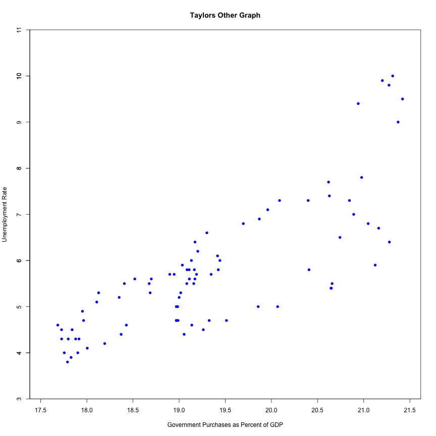
Use the data set you constructed to reproduce Taylor’s other scatter plot. That is, produce a scatter plot using only the observations from Q1 of 1990 to Q3 of 2010.
(a) As you do this, try to format the dates as dates (look up how to do this using the as.Date() function). This will help you to produce nice looking plots within R.
Plot Taylor's Other Graph
#plot the graph to replicate Taylor's
plot(alldata2010$govasgdp, alldata2010$UNRATE, xlab = "Government Purchases as Percent of GDP",
     xlim = c(17.5,21.5), ylim = c(3,11),
     pch = 16,
     asp=.5,
     main = "Taylors Other Graph"
     ,xaxs = "i"
     ,yaxs = "i"
     ,xaxt = "n"
     ,ylab = "Unemployment Rate", col = "blue"
     )
axis(side = 1, at = 34:44/2) # x axis
axis(side = 2, at = 3:11 # y axis
)
Three >>>>>
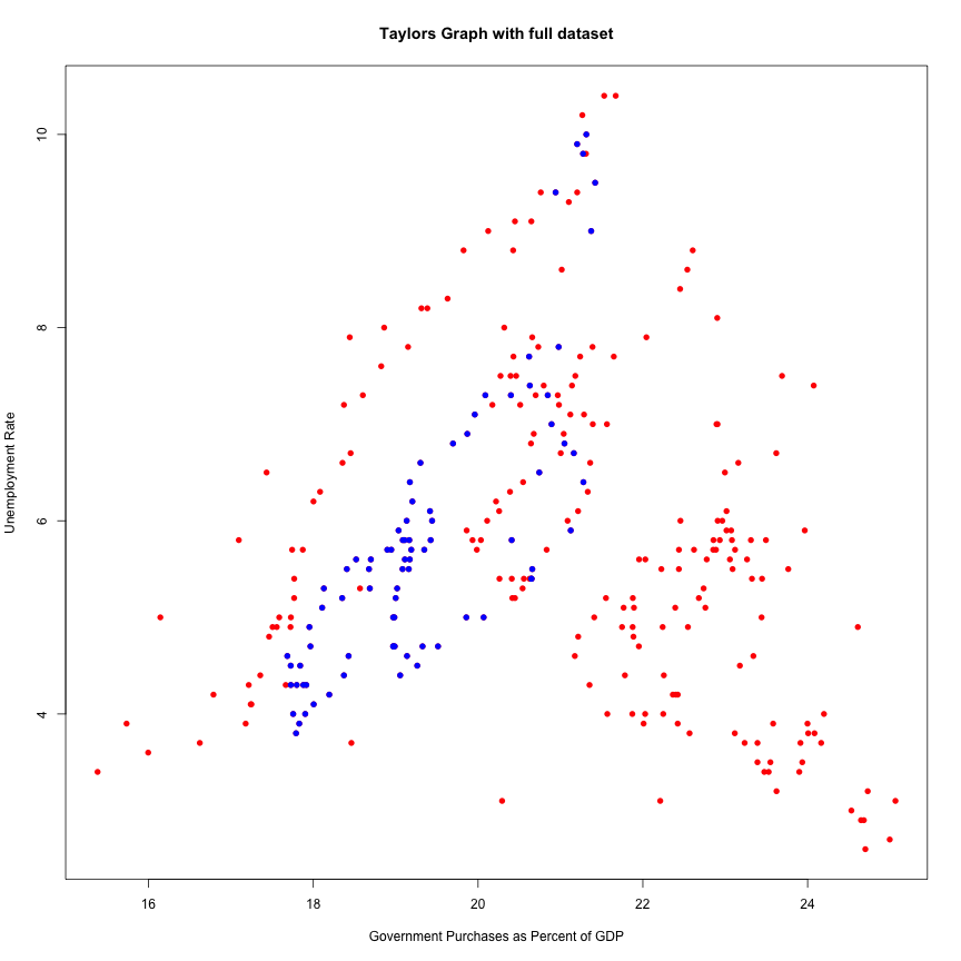
Compare the scatter plot you obtain using the full data set to the one that Taylor reports.
(a) For this comparison, you may want to use different plotting characters and colors, and the points() function to produce different plotting characters for different parts of the sample.
Compare Taylor's graph to full dataset:
#compare all data (red) to 1990-2010 data (blue)
alldata$govasgdp <- (alldata$GCE / alldata$GDP)*100

plot(alldata$govasgdp, main = "Taylors Graph with full dataset"
     , alldata$UNRATE, xlab = "Government Purchases as Percent of GDP",
     ylab = "Unemployment Rate", col = "red", pch=16)
points(alldata2010$govasgdp, alldata2010$UNRATE, xlab = "Government Purchases as Percent of GDP",
     ylab = "Unemployment Rate", col = "blue", pch=16)
OBSERVATION: This graph shows Taylor’s correlation in blue compared to the full dataset in red. This is a great visual demonstration of how the correlation of the full dataset is not represented by Taylor’s targeted time-frame
Four >>>>>
Analyze the statistical relationship between seasonally-adjusted unemployment and government expenditures in a way that is informative and insightful. Some questions you should consider as you perform the analysis:
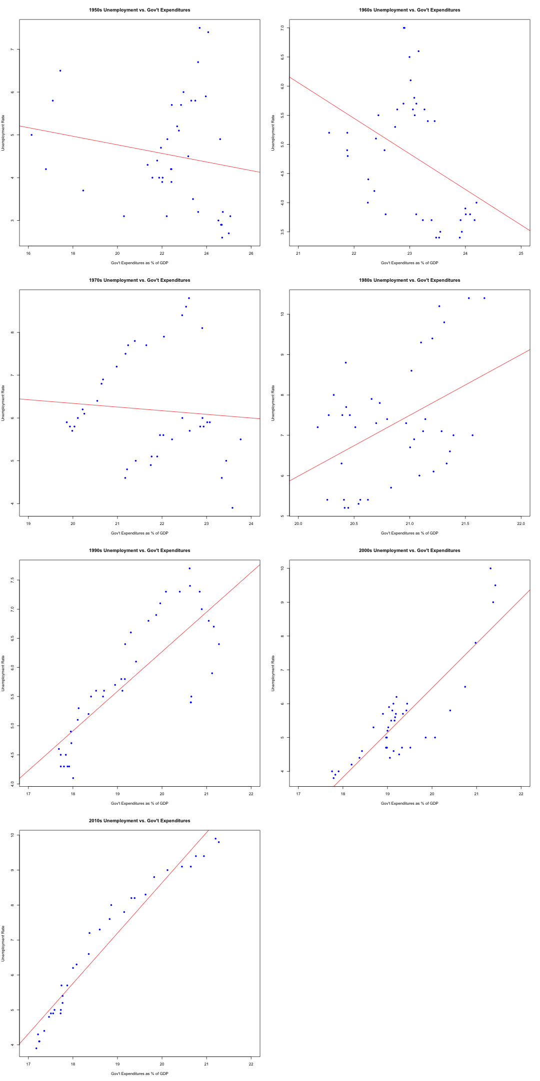
(a) Is the correlation that Taylor presents in his scatter plot stable over time? In your analysis, you could compute the correlation separately decade. In addition to calculations, your analysis should include informative plots that support your main points.
(b) Write up your comments concisely in a typed report.
Compare Taylor's data to other time periods
par(mfrow=c(4,2)) # Divide plots area to include multiple plots
#Find a correlation for every decade between 1950-2018
alldata1950 <- subset(alldata, DATE >= "1950-01-01" & DATE <= "1959-10-01")
cor(alldata1950$UNRATE,alldata1950$govasgdp)
plot(alldata1950$govasgdp,alldata1950$UNRATE,abline(lm(alldata1950$UNRATE ~ alldata1950$govasgdp),col="red"),xlab = "Gov't Expenditures as % of GDP",
     ylab="Unemployment Rate", main="1950s Unemployment vs. Gov't Expenditures", pch=16,col="blue",xlim=c(16,26))

#1960s
alldata1960 <- subset(alldata, DATE >= "1960-01-01" & DATE <= "1969-10-01")
cor(alldata1960$UNRATE,alldata1960$govasgdp)
plot(alldata1960$govasgdp,alldata1960$UNRATE,abline(lm(alldata1960$UNRATE ~ alldata1960$govasgdp),col="red"),xlab = "Gov't Expenditures as % of GDP",
     ylab="Unemployment Rate", main="1960s Unemployment vs. Gov't Expenditures", pch=16,col="blue",xlim=c(21,25))

#1970s
alldata1970 <- subset(alldata, DATE >= "1970-01-01" & DATE <= "1979-10-01")
cor(alldata1970$UNRATE,alldata1970$govasgdp)
plot(alldata1970$govasgdp,alldata1970$UNRATE,abline(lm(alldata1970$UNRATE ~ alldata1970$govasgdp),col="red"),xlab = "Gov't Expenditures as % of GDP",
     ylab="Unemployment Rate", main="1970s Unemployment vs. Gov't Expenditures", pch=16,col="blue",xlim=c(19,24))
#1980s
alldata1980 <- subset(alldata, DATE >= "1980-01-01" & DATE <= "1989-10-01")
cor(alldata1980$UNRATE,alldata1980$govasgdp)
plot(alldata1980$govasgdp,alldata1980$UNRATE,abline(lm(alldata1980$UNRATE ~ alldata1980$govasgdp),col="red"),xlab = "Gov't Expenditures as % of GDP",
     ylab="Unemployment Rate", main="1980s Unemployment vs. Gov't Expenditures", pch=16,col="blue",xlim=c(20,22))

#1990s
alldata1990 <- subset(alldata, DATE >= "1990-01-01" & DATE <= "1999-10-01")
cor(alldata1990$UNRATE,alldata1990$govasgdp)
plot(alldata1990$govasgdp,alldata1990$UNRATE,abline(lm(alldata1990$UNRATE ~ alldata1990$govasgdp),col="red"),xlab = "Gov't Expenditures as % of GDP",
     ylab="Unemployment Rate", main="1990s Unemployment vs. Gov't Expenditures", pch=16,col="blue",xlim=c(17,22))

#2000s
alldata2000 <- subset(alldata, DATE >= "2000-01-01" & DATE <= "2009-10-01")
cor(alldata2000$UNRATE,alldata2000$govasgdp)
plot(alldata2000$govasgdp,alldata2000$UNRATE,abline(lm(alldata2000$UNRATE ~ alldata2000$govasgdp),col="red"),xlab = "Gov't Expenditures as % of GDP",
     ylab="Unemployment Rate", main="2000s Unemployment vs. Gov't Expenditures", pch=16,col="blue",xlim=c(17,22))

#2010s
alldata2010 <- subset(alldata, DATE >= "2010-01-01" & DATE <= "2018-04-01")
cor(alldata2010$UNRATE,alldata2010$govasgdp)
plot(alldata2010$govasgdp,alldata2010$UNRATE,abline(lm(alldata2010$UNRATE ~ alldata2010$govasgdp),col="red"),xlab = "Gov't Expenditures as % of GDP",
     ylab="Unemployment Rate", main="2010s Unemployment vs. Gov't Expenditures", pch=16,col="blue",xlim=c(17,22))

OBSERVATION: The charts above clearly demonstrate that the correlation he presents in his scatter plot is misleading because the correlation between seasonally-adjusted unemployment and government expenditures varies wildly across each decade. He cherry picks the two decades that support his argument while failing to include the decades where the correlation is negative or very weak (1950s-80s). Therefore, the correlation between unemployment rates and government expenditures cannot be used as an argument by either side to justify their position. There are numerous factors that affect the unemployment rate so we cannot conclude that government expenditures has any impact on the unemployment rate.
Five >>>>>
Write code – likely using for loops – to simulate the process of “cherry picking” in Wolfers’ terminology, and use it to evaluate the seriousness of this part of the criticism. Some suggestions and refinements to guide your coding journey.
(a) The code should generate two uncorrelated variables x and y (e.g., from a Normal distri- bution) over a time series of 256 quarters
(b) Using these variables, use R to compute the correlation between x and y over the last 60 quarters, over the last 61 quarters, over the last 62 quarters.... all the way until... over the last 256 quarters (the full sample).
i. A researcher who is cherry picking the begin date will then select the lowest corre- lation. Have your code do this and store the maximum “cherry picked” correlation, but for comparison, you should also store the correlation over the entire sample (“not cherry picked”).
(c) Repeatthisprocessfor1000possible“cherrypicked”correlationsand“notcherrypicked” correlations. Store the output.
i. Are the cherry picked correlations different than the not cherry picked correlations? Use both visual (plots to compare) and numerical evidence (t-tests).
ii. Using the simulated cherry picked sample of correlations, conduct a t-test to evaluate whether Taylor’s computed negative correlation could be generated from this cherry picking process with zero underlying correlation.
Create random variables and divide into full and cherry-picked sets of data
#code generates two uncorrelated variables x and y (from Normal distribution) over a time series of 256 quarters
x <- rnorm(256, mean=0, sd=1)
y <- rnorm(256, mean=0, sd=1)
xycor <- cor(x,y)
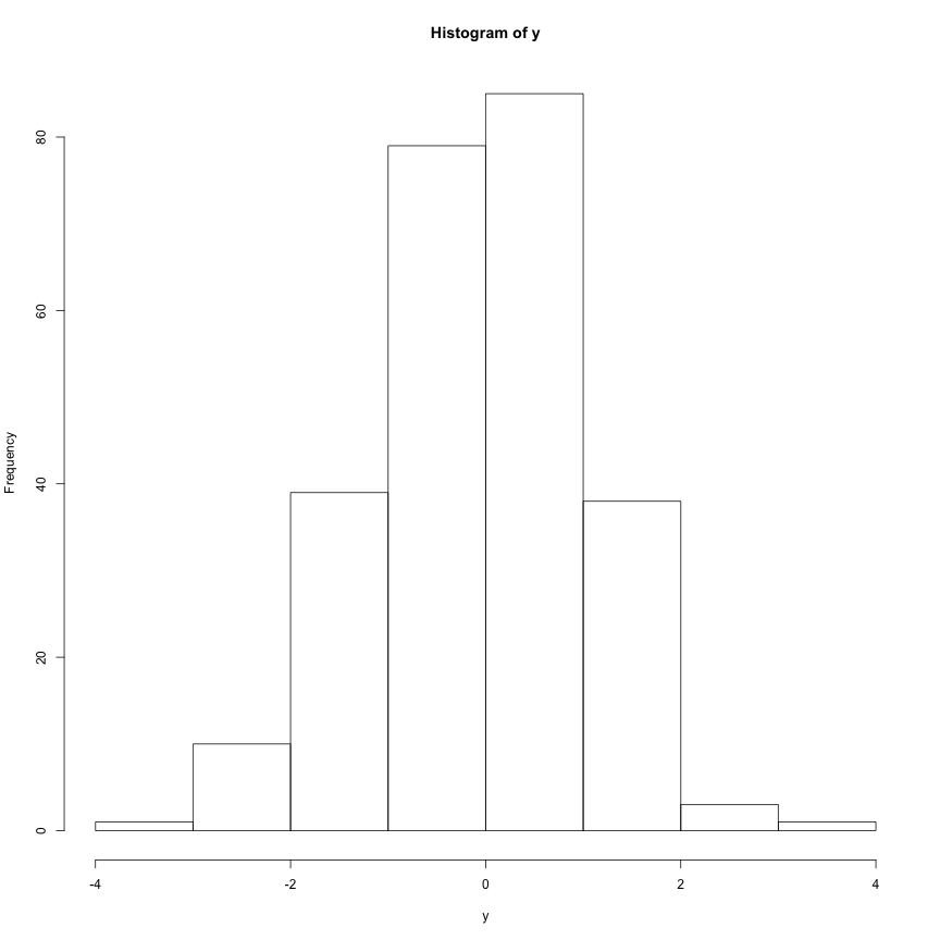
hist(y)
datasetxy <- rep(NA, 100)
for (i in 1:256){
  x <- rnorm(256, mean=0, sd=1)
  y <- rnorm(256, mean=0, sd=1)
  datasetxy[i]= cor(x,y)
}
Rough view of the data
#optional view of data
summary(datasetxy)
##       Min.    1st Qu.     Median       Mean    3rd Qu.       Max.
## -0.1653227 -0.0421612  0.0004262  0.0015909  0.0380250  0.1934265
## [1] 0.0091360643 0.0541293044 0.0541981430 0.0256343954 0.0310812972
## [6] 0.0003173823
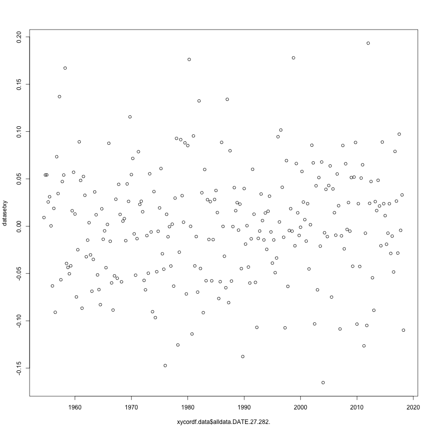
plot these correlations against time-frame 1954 - 2018
xycordf.data <- data.frame(alldata$DATE[27:282], datasetxy)
head(xycordf.data)
##   alldata.DATE.27.282.    datasetxy
## 1           1954-07-01 0.0091360643
## 2           1954-10-01 0.0541293044
## 3           1955-01-01 0.0541981430
## 4           1955-04-01 0.0256343954
## 5           1955-07-01 0.0310812972
## 6           1955-10-01 0.0003173823
plot(xycordf.data$alldata.DATE.27.282., datasetxy)
find correlation over last 60 quarters
xy60 <- cor(x[196:256], y[196:256])

xyfulllist <- rep(NA, 196)
placeholderx <- 0
placeholdery <- 0
for (i in 1:196) {
  placeholderx <- 197 - i
  placeholdery <- 197 - i
  xyfulllist[i] <- cor(x[placeholderx:256], y[placeholdery:256])
}

#correlation over full plot = 0.03561521
#max correlation within sample = 0.04351795 with 121 observations
cor(x,y)
whichset <- c(61:256)
xyfulldf <- data.frame(whichset, xyfulllist)
sortedxy <- xyfulldf[order(xyfulllist),]
#last position of this sorted dataframe willshow which set of data has the highest correlation
orig1000 <- NA
cherr1000 <- NA

for (i in 1:1000){

  xyfulllist1 <- NA

  placeholderx1 <- 0
  placeholdery1 <- 0

  x2 <- rnorm(256, mean=0, sd=1)
  y2 <- rnorm(256, mean=0, sd=1)

  orig1000[i] <- cor(x2,y2)

  for (k in 1:196) {
    x1 <- rnorm(256, mean=0, sd=1)
    y1 <- rnorm(256, mean=0, sd=1)

    placeholderx1 <- 197 - k
    placeholdery1<- 197 - k
    xyfulllist1[k] <- cor(x1[placeholderx1:256], y1[placeholdery1:256])
  }
  cherr1000[i] <- max(xyfulllist1)
}
plot cherry picked vs. original
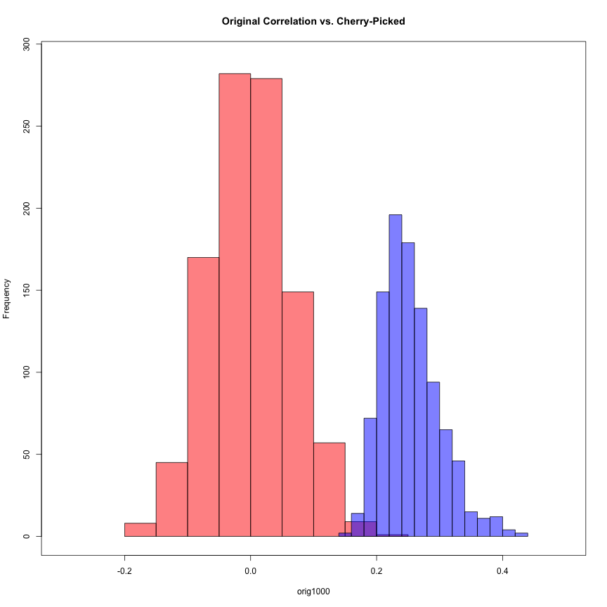
hist(orig1000, col=rgb(1,0,0,0.5),xlim=c(-.3,.5), ylim=c(0,290), main="Original Correlation vs. Cherry-Picked")
hist(cherr1000, col=rgb(0,0,1,0.5), add=T)
box()
t test to compare two datasets
t.test(cherr1000, orig1000)
##
## 	Welch Two Sample t-test
##
## data:  cherr1000 and orig1000
## t = 102.41, df = 1815.3, p-value < 2.2e-16
## alternative hypothesis: true difference in means is not equal to 0
## 95 percent confidence interval:
##  0.2481496 0.2578401
## sample estimates:
##  mean of x  mean of y
## 0.25360083 0.00060598
#t = 102.26, df = 1847.5, p-value < 2.2e-16
#this p-value indicates that these two datasets are indeed statistically significant
#the high positive t value indicates that the cherry picked data pushes the mean far in the positive direction
#Taylor's correlation (1990-2010) = 0.8242042
#compare cherry-picked data to Taylor's correlation
t.test(cherr1000, mu=0.8242042)
##
## 	One Sample t-test
##
## data:  cherr1000
## t = -395.32, df = 999, p-value < 2.2e-16
## alternative hypothesis: true mean is not equal to 0.8242042
## 95 percent confidence interval:
##  0.2507684 0.2564332
## sample estimates:
## mean of x
## 0.2536008
#t = -378.73, df = 999, p-value < 2.2e-16
# The p-value indicates there is a statistically significant difference between the cherry-picked data and Taylor's
# This indicates that it is very unlikely Taylor cherry-picked his data and he reported a valid correlation
OBSERVATION::
After iterating through the full dataset of correlations between random variables and comparing it to the cherry-picked data, it is clear how much of an impact this technique can have on the final results. The full data is centered around a mean of 0 while the cherry-picked data is centered around a mean of .25 and has very little overlap with the original data.
According to the t-test between the full data set and cherry-picked data, the p-value indicates the two datasets are statistically significant at the 5% level. A high t-value of 102 indicates that the cherry-picked sample is 102 standard errors above the full dataset mean.
According to the t-test between the cherry-picked data and Taylor’s correlation of 0.8242042, the p-value indicates these results are statistically significant and the t-value of -382 indicates that the cherry-picked data is 382 standard errors below Taylor’s strong correlation.
CONCLUSION: After running a cherry-picking data experiment on two purely random variables, we must reject our null hypothesis that Taylor’s data is cherry-picked using a similar method. The odds of finding such a strong correlation are just too low to be reasonably plausible. A correlation between his original data points certainly exists to some extent.
However, just because we are ruling out this version of cherry-picking data in Taylor’s analysis does not mean we can rule out other forms of bias. Taylor chose a convenient time period to demonstrate his point without explaining that this small sample did not represent the correlation over time for all of the data available. Indeed, economics is a complex issue involving many moving pieces such as action taken by the federal reserve, the politics of the administration currently in power, and the overall strength of the economy at the time which makes it hard to conclude a direct sole correlation between two variables, let alone at such a powerful magnitude.
###global adjustments start 02
options(warn = oldwarnval) #reset the warning message
###global adjustments end 02
Thank you!!
